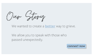
Canva was extremely helpful. Even with the free version, I was able to find fonts that I wanted, and that fit with the feel I was going for. It automatically saved my work, similar to how Google Drive works, which was extremely helpful because I was afraid it would delete as I closed the tab, similar to how PicMonkey did when I first began this digital process. Canva also included a free library of clipart that I was able to utilize, and made it extremely easy for me to create my own sort of clipart, utilizing premade shapes and just altering them to how I wanted. Overall, it made this process way easier than I had expected.


I did make some changes from the original sketches:
I decided to keep with an overall blue tone, rather than inserting green in certain spots. I decided I will incorporate green in other ways; it just did not fit within this aspect of the opening.
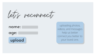
I also changed the layout of the third slide a bit. I removed the "relation" text spot because I thought it was unnecessary, and I moved the information about the upload button to the right, getting rid of some empty space, and enlarged the other parts of the shot.
I also added a fourth slide, a loading screen. Canva did not have any loading bar clip art so I did a simple google search for one. I wanted a gif, so it would seem like an actual website as the bar "loads". I just chose a simple gif for this part, but I think it was an important detail.
I'm very happy with how it turned out, and I have already decided how it will appear on the screen to make it more realistic as a website. I'm very excited, and sort of anxious, to see how it will appear on camera and in post-production.


No comments:
Post a Comment