When it came to the initial landing screen, I wanted some imagery regarding grief and loss, like the rose and the picture frame with a family in it, to hopefully create a welcoming but understanding space. I want the main pale green to be the accent color of all of the pages, so it is seen as the colors of the title's shadows and the main color of the buttons on the screen. After the first draft, I realized I needed to add a sort of "more information" option, to introduce the app in more detail to the audience and to Alice. So, in the second rendition, I added a smaller "our story" button to the bottom left. I also played with the colors of the secondary button, as it is less of the focus, seen with the gray button underneath.
I also wanted to see how the blue markers I had went in with the other colors, and how they showed on paper. None of them resembled the pale blue I had on my color scheme, so I decided not to use it on the sketches. I did, however, decide that the pale blue would be the background color of all of the screencaps. With the other sketches, I wanted to go through the series of events that would appear through the film, similar to a storyboard.
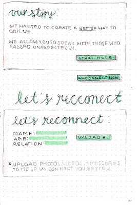
 For the second slide, I wanted to quickly show what the "our story" page would be like. Especially drafting what information would be on it. I wanted it to be short, straight to the point, and not go into much detail as to what the app does. I also played around with the wording on the button, comparing "start here" and "reconnect now", the latter being more direct with the app name.
The third and final slide is the "sign up" part. It goes into more detail as to what is needed for the app to work, and include simple information that the app would realistically need for it to work like the name, age, and relationship to the person a user would want to "reconnect" with. You can also see the part where I initially messed up the spelling of reconnect, and it made it worse since I never really sketched anything out, I went straight in with a pen.
Next, I'll work on digitally creating these images, which will be more true to the color scheme I initially decided on, giving a clearer idea as to how they look together.


No comments:
Post a Comment