Tuesday, March 31, 2020

Set Design - Actual Designing

Recently while rummaging through some stuff in my room, I found my old HP Sprocket, which is a pocket photo printer. I used it for many of the older photos on my wall, but the wall hasn't been updated in a while. Now that I need to update my wall, I'm glad I have my sprocket to do it too. I don't have much photo paper to print with, I have only 20, so I am keeping what I'm printing with the Sprocket very limited, and the rest will be printed on my real printer. One main change I am making to my wall is extending it to the adjacent wall.

One of the introductory shots of the scene, which I was hoping to achieve, is a slow pan from the window, passing the wall and the photos, and then focusing on Alice on her bed. I took a trial shot of the footage I want on my phone to see if it would work, and it did very well. For reference, this is the video I want, and the blank wall at the end is where I will be adding the new photos.
After adding photos

The video shows the before, and the picture is the after. In the process of printing and pasting pictures, I also found some other stuff that I had planned to put on my wall, like my playbills, so it was a good filler also. I may play around with the positioning a bit more, but overall I am content with how it turned out. When picking out the pictures, however, I didn't want to print all of the ones I had with my boyfriend, because my idea for the credits includes other pictures and videos and I didn't want to repeat any.

One thing that I am not exactly happy with is how much surface area the pictures and stuff took up. I wanted to extend the picture wall further to make it look fuller, but I didn't have enough printing paper. While shooting, I think I will just position myself closer to the edge of the picture part, and the rest of the blank space will hopefully make it easier to focus on my face rather than the tons of mini faces in the back.

Saturday, March 28, 2020

Set Design - Idea Process

So, currently, I am at my Dad's place, and even though I do have a room here and everything, I have more time this weekend and I would prefer my room at my Mom's room to be the official set for my film opening. The way my room is set up with my Mom is more of what I have envisioned for Alice's room.

Photo Wall in my Room
Something I had envisioned for Alice's room is a bunch of pictures on her walls, showing her life, friends, family, and Jacob of course. Maybe it's because I already have that in my room, and when creating a teenage girl the best example I have is me. Already having some pictures on my walls helps a lot because it means I don't have to print as many photos and the accumulation of many different photos over time that I already have makes it more realistic. The only pictures that I will have to add are pictures of Alice and Jacob. Since I am casting myself as Alice, thank you coronavirus, it just makes sense that I put pictures of my boyfriend and I. I already have to update my wall, so this won't feel like much of a chore and I won't have to take anything down afterward.
Large Window in my Room

Another part of my room that I want to incorporate into my opening is this huge window I have looking onto the street. As I mentioned in my last posting, I also want to incorporate some wide cinematic shots to establish an overall middle-class suburban setting. At the moment I am considering a pan from the window to the bed, looking through the pictures on the wall, as an opening shot to incorporate all of these aspects. Overall, I am very excited to begin filming soon. My only true set plan so far is to overshoot different angles, shots, and lighting choices and then decide which is the best in post-production.

Thursday, March 26, 2020

Inception Inspiration

Another quarantine movie I watched is Inception, the Christopher Nolan film, that came out back in 2010.
Inception (2010)
Again, I was inspired by the shots, the angles, and the composition of the entire film. Throughout the film, there were so many beautiful establishing shots and wide shots of landscapes and action in the film. It made me realize that I didn't really have anything being established in my film opening, setting wise, other than Alice's room.


Even though the opening scene of my film is not set in a very "special" place, I still want to establish more aspects of Alice' s life in a "2 + 2 not 4" way. For example, I could include some shots of my neighborhood to establish that Alice comes from a middle-class family living in the suburbs, just as I do. I can also focus on wide shots within the room to show parts of her personality because there is no better way to get to know someone than to see how they live.

In regard to this whole social-distancing and quarantine situation, I'm really glad that it's giving me more time to get out of my own head, see other films, and think about other possibilities of my film opening. 

Wednesday, March 25, 2020

Is This a Horror Film Now?

No, I did not completely change my concept. I did, however, watch Midsommar, the A24 horror/drama film that came out last year.
Midsommar (2019)
Originally I saw it just for fun with my mom and sister, but from the beginning, I was extremely intrigued and inspired by the technique used in the first fifteen minutes of the film. Since my film is not similar to Midsommar in any way, I am not relying on the full opening scene for guidance. One part did stick out to me though, which I do think I can learn from.


This scene was where Dani, the main character, was on the phone with her best friend and she replies to her sister's ominous email.

What I appreciated most of these screenshots is the lighting and composition of the shots, especially because they could be applied to my film out of context. I love how the low-key lighting added to the suspense while also not feeling out of place, and that the light sources, even though there were many, did not overpower the feel. This aspect especially. I know will be featured in my opening.

Another aspect that really stood out to me was how the scene moved swiftly, and did not seem boring, even though the main character was fairly stationary. A concern from my first storyboard that I had was that it was not dynamic enough to be interesting for the full two minutes. Switching between close-ups of her hands, to close-ups of the screen, to close-ups of her face made the scene feel active, yet still calm and suspenseful.

As I finalize my storyboard, I want to incorporate more movement into the shots and test out the order of the shots and incorporate similar close-ups. Even though my film is not a horror or thriller one, I do still want to incorporate the suspenseful aspects seen in both genres, as well as in the dystopian genre.

Sunday, March 22, 2020

To Voiceover or Not To Voiceover


Her (2013)
Recently, I was advised by one of my peers to watch the film Her to see how they introduce the app featured in the film. Other than the exceptional use of color, I realized how the app featured a voiceover and focused many of the shots on the main character's expressions rather than the graphics of the app itself. I decided I may be able to integrate the feature of the voiceover, while also not discarding all of the work I had done prior.

I am still unsure as to whether I do want to mirror exactly what happens in Her, but I created a revised screenplay just in case.

My plan of action is to film as I normally would, and maybe incorporate the voiceover in post-production. It's especially easy because even if I was set on the voiceover, the addition would still be done in post.

Here is the revised screenplay:


Going Digital

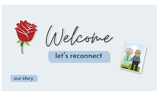
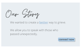
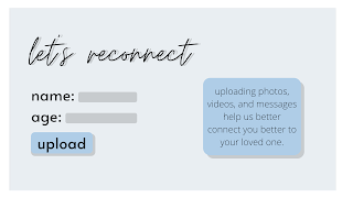
As my filming days near, I have to finalize the digital version of the app graphics. Using the online designer Canva, I was able to create the digital renditions of the graphics I had sketched earlier on in the process.

Canva was extremely helpful. Even with the free version, I was able to find fonts that I wanted, and that fit with the feel I was going for. It automatically saved my work, similar to how Google Drive works, which was extremely helpful because I was afraid it would delete as I closed the tab, similar to how PicMonkey did when I first began this digital process. Canva also included a free library of clipart that I was able to utilize, and made it extremely easy for me to create my own sort of clipart, utilizing premade shapes and just altering them to how I wanted. Overall, it made this process way easier than I had expected.

I did make some changes from the original sketches:

I decided to keep with an overall blue tone, rather than inserting green in certain spots. I decided I will incorporate green in other ways; it just did not fit within this aspect of the opening.

I also changed the layout of the third slide a bit. I removed the "relation" text spot because I thought it was unnecessary, and I moved the information about the upload button to the right, getting rid of some empty space, and enlarged the other parts of the shot.

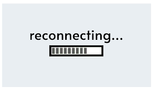
I also added a fourth slide, a loading screen. Canva did not have any loading bar clip art so I did a simple google search for one. I wanted a gif, so it would seem like an actual website as the bar "loads". I just chose a simple gif for this part, but I think it was an important detail.

I'm very happy with how it turned out, and I have already decided how it will appear on the screen to make it more realistic as a website. I'm very excited, and sort of anxious, to see how it will appear on camera and in post-production.

Thursday, March 19, 2020

COVID-19 Changes

As COVID-19 rapidly spreads throughout my country, many people are practicing social-distancing protocols to keep safe, like myself. However, this causes a few problems with my project.

  1. I was planning to film in a friend's room, but no longer will.
  2. The same friend was also going to act as my main character Alice.
  3. I can no longer go shopping outside for the costume, as I had originally planned.
For filming and casting, I have decided to work completely by myself. My room does not have the same amount of natural light as my friend's room does, which I believe will be an obstacle when figuring out lighting, but it will have to do. I will also have to cast myself. I never really pictured myself as an actress, especially not one who could cry on command, but I guess I will just have to research acting methods and bring you along as I crash course acting.

Because of this, I think I will also be postponing filming from this week to the next. This week, I will just be finalizing everything with graphics, and hopefully learn how to act, in preparation for filming next week. I also have to decorate my own room.

Originally when casting my friend, it was easy with set design because I had envisioned Alice's room as a simple one, with pictures of her and Jacob, as well as her with her friends and family, across her walls; my friend already had this sort of room with her and her current boyfriend. To me it just made sense, but I now have to decorate my own room like that. It won't be much of a hassle, but it will just be time-consuming I think.

Overall, I'm grateful that I do not have to completely change my film idea, nor is much of the content changing, as I'm sure some of my peers will be having more difficulty dealing with the current situation.

Sunday, March 15, 2020

Initial App Graphic Sketches

Once I had decided on the name, I felt more prepared to make some first draft sketches. I guess this can also be considered another journal post, as I did draw the initial drafts inside of the journal. On another note, the markers and pen I have don't exactly resemble the color scheme I had shown before, so try to imagine those colors in these sketches.

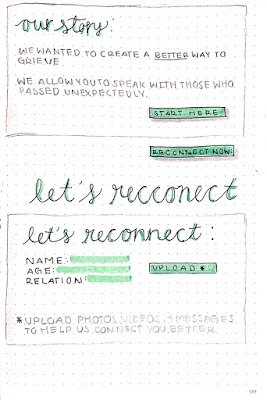
When it came to the initial landing screen, I wanted some imagery regarding grief and loss, like the rose and the picture frame with a family in it, to hopefully create a welcoming but understanding space. I want the main pale green to be the accent color of all of the pages, so it is seen as the colors of the title's shadows and the main color of the buttons on the screen. After the first draft, I realized I needed to add a sort of "more information" option, to introduce the app in more detail to the audience and to Alice. So, in the second rendition, I added a smaller "our story" button to the bottom left. I also played with the colors of the secondary button, as it is less of the focus, seen with the gray button underneath.

I also wanted to see how the blue markers I had went in with the other colors, and how they showed on paper. None of them resembled the pale blue I had on my color scheme, so I decided not to use it on the sketches. I did, however, decide that the pale blue would be the background color of all of the screencaps. With the other sketches, I wanted to go through the series of events that would appear through the film, similar to a storyboard.

For the second slide, I wanted to quickly show what the "our story" page would be like. Especially drafting what information would be on it. I wanted it to be short, straight to the point, and not go into much detail as to what the app does. I also played around with the wording on the button, comparing "start here" and "reconnect now", the latter being more direct with the app name.

The third and final slide is the "sign up" part. It goes into more detail as to what is needed for the app to work, and include simple information that the app would realistically need for it to work like the name, age, and relationship to the person a user would want to "reconnect" with. You can also see the part where I initially messed up the spelling of reconnect, and it made it worse since I never really sketched anything out, I went straight in with a pen.

Next, I'll work on digitally creating these images, which will be more true to the color scheme I initially decided on, giving a clearer idea as to how they look together.

The Naming Game

In the process of designing the app graphics, I realized I needed a central name to go back to when making what the app could be.

When I thought of existing films in similar genres, I noticed similar trends: one-word titles and the titles always go back to the piece of technology that the film is centered around. So, if I was able yo decided on a name for the app in my film, I could kill two birds with one stone and be able to name the film at the same time. Some examples are:
Matrix (1999)

Tron (1982)

The Terminator (1984)

Ex Machina (2014)

Nerve (2016)

Wall-E (2008)
When going to name my app, I looked at the App Store for current applications aimed to help with grief and mental health. Some of the names were:

  • Woebot
  • Good Grief
  • iHeal because iFeel
  • iGrief
  • Unspoken
  • Smile & Tears
From there, I thought about the main purpose of an app like mine, it's main features, and a short name that would be good for an app and a film. Some of the names I thought of were:
  • iConnect
  • Reconnect
  • iRecconect
  • Connection
  • iConnect with Family
I decided on Recconect because I thought it was the simplest, and most straightforward when relating to the film and the features of the app.

Friday, March 13, 2020

Costume Ideas

As I discussed in my blog post titled "Apps in Film", I decided on a simple color story for my film opening.
Since yellow can represent nativity, madness, obsessiveness, and insecurity, I want that color to be the main color that Alice wears and is associated with. Since she will be sitting in her room, and most of the shots will only show her shirt, I wanted her top to be as close to the shade of yellow I chose as possible.

Since it is set in the night, and she is comfortable in her room, I don't want the shirt to be over the top in any sense; I want her to look comfortable. So naturally, I googled to find the perfect shirt. Also, I do not own any shirt of this color either, so I suppose I would have to buy the item myself; so, I am going to keep the maximum amount of money I want to spend at $25.

On the Forever 21 website, I was able to find three shirts of the same color, at the same price, each with different styles.
This shirt is the Ribbed Crew Neck Tee, from Forever 21. What I like about the shirt is that it's simple, and gets the point across. However, it may be too simple.


This shirt is the Ribbed Henley Top, also from Forever 21. It's a deeper, more yellow tone than the other shirt, and it seems more casual and less plain. However, I don't know if the color of this shirt, and the other one, will be true to the pictures once I order one of them.

Overall, I could order both and still be under the budget, so that is one option. I am leaning more towards the Henley top, but I am scared of sizing, when it will deliver, and the color of course. I really want most of the colors in the scene to be pale and cool-toned and I would need to make sure they both fit, especially with whatever lighting I buy.

When it comes to other parts of the costume, I want to keep it fairly simple. For bottoms, probably some dark-colored denim jeans. For accessories, maybe one necklace that may tie into Alice's relationship with Jacob, as well as some rings.

And for the short opening scene, the costume will be all dark-colored, most likely black. I'll update on the official costumes once I begin filming, or have them organized.

Wednesday, March 11, 2020

First Screenplay Draft

I finally have my first screenplay draft! I read a lot of blogs, like scriptreaderpro.com, that emphasized the importance of a first draft. Much of the advice fell along the lines of: "write a rough first draft, take a step back, rewrite with new eyes". With that being said, here is my first rough draft:


For this, I used the software celtx.com. It was an easy tool to learn and use, and I appreciate that it all saves onto a cloud similar to Google Drive.

On another note, to get other perspectives, I reached out to a few friends who also enjoy film and various arts to critique my screenplay. I am still awaiting their response, but I predict that a new version of the screenplay will come about after listening to what they have to say.

Sunday, March 8, 2020

Another Journal Update

Onto planning for our third week, not much has changed. I enjoyed the simplicity of last week's layout, compared to the layout of two weeks ago, so I kept it again for this week. I also kept the notes section; it helped me a lot with deciding what needs to be completed this week, as well as just jotting down general ideas for the film as a whole. One thing I did add, however, was post reminders. I realized I was not logging or posting my progress within this blog, which, of course, defeats the purpose of having this blog. I added reminders for specific blog posts to keep track of where I am, and to keep the posts as aligned with the timeline I am working on as I can. I want this blog to be like an online diary, similar to how I use my journal, but online. Hopefully, the reminders to post, as well as reminders to keep working, will allow me to keep my blog frequently updated. Reflecting upon last week, however, I got stuck on how details when it came to the app graphics, as well as practicality on how the graphics will be displayed and how they will be shot. The lighting regarding the computer and phones, though, is an issue I am postponing until I can truly see how it pans out when I begin production.

Apps in FIlm


When creating the app visuals for the film opening, I wanted to look more into how technology is portrayed in futuristic time settings. The first film that comes to my mind is Nerve.

Nerve (2016)

This film also revolves around an app, but this app, "nerve", dares the players to do outrageous acts in a live stream for money. Just by seeing the posters, three main colors pop out: teal, blue, and neon purple/pink. These three colors appear throughout the film, always when discussing the app, as the apps' interface heavily incorporates them. The colors align with the themes and moods of the story, as color theory suggests. The overall bright saturation of the tones corresponds with the fast-paced energy of the editing, storyline, etc. More specifically, the purples amplify the ominous and fantastical aspects, the blues amplify the cerebral aspects, and the greens of the teal amplify the danger and corruption. However, this film never has any direct shots of the app's interface; instead, the editing displays the interface onto the screen, as if they are viewing from inside the computer or phone being used. This is especially seen in the beginning, when one of the main characters signs up.

Screencaps from the Trailer:


Reflection:

My main takeaway from Nerve was to focus on colors that amplify the moods of the scene; so, for my film opening, I would like to use cool, less saturated tones. Similar to Nerve, I would like to focus on greens for the ominous nature, and possibly some yellows to display nativity or innocence. However, unlike Nerve, I want to stray away from the neon and focus on more softer colors.
Using coolors.co, I created this general color scheme I want for the film opening. The black, pale blue, and brighter blue would be the main colors for the app interface. The yellow would be focused on Alice's clothing or room decor, as well as parts of the green. 

Saturday, March 7, 2020

First Storyboard Draft

As planned, I have my first storyboard completed. I have decided how I want the opening to play out, to the exact details, at least until I change my mind.

Forgive me if my drawing skills are not the best, but this is the general idea:

I want to begin with my main character, Alice, on the phone with a friend, discussing the recent passing of her boyfriend. As they talk about how Alice is grieving, they joke around and google something silly like, "how to grieve", and end up coming across an ad for the app the whole film revolves around. Alice becomes intrigued, hangs up with her friend, and proceeds to comply with the directions the app gives during the "set-up" process. It ends with an extreme close-up of Alice's face as she answers her first phone call, going through three main emotions, with a heavy focus on her facial expressions. Alice will first appear confused or skeptical about the app, surprised that she can hear his voice, and ends with her smile.

From this, the next steps are to finalize the screenplay and begin preparing for production. One aspect I am both excited and nervous about is developing the visuals for the computer and phone, creating the app from scratch. 

Thursday, March 5, 2020

Planning for the Week

An update on my journal: what I've changed and what I've kept.

One major change I made from last week was the amount of planning ahead I did. I felt very overwhelmed last week thinking that I had to finish so much in such little time, on top of my homework and extracurriculars during the week. I took a step back and realized that I have no reason to rush, and it will lead to me being overworked and producing subpar content. For this week, I went very simple; not only with the layout, evidently, but also with the tasks. I also added a notes section, something I did not have last week. I will try to utilize it as a small section to write what I think I need to get done by next week, ideas for production I don't want to forget, and simple reminders to maybe buy or make items. Tonight, I will post the final storyboard I have, as well as give a preliminary view into the set I want to use for the majority of the opening. By this weekend, I plan to have my screenplay finished, and begin working on props and the graphics I will need for the "app" featured in the opening. Those are the main goals for the week, as well as some other minute details I want to work on.

I like the idea of these weekly posts showing my journal because I think it is a good visual in my thought process and my own timeline for the project overall.

Final Project

 I am happy to present, the final project for Teddy: Click here for trailer #1 Click here for trailer #2 Click here for the Instagram page o...